We’ve designed our entire digital world around one lazy gesture:
Scroll down. Keep scrolling. Scroll some more.
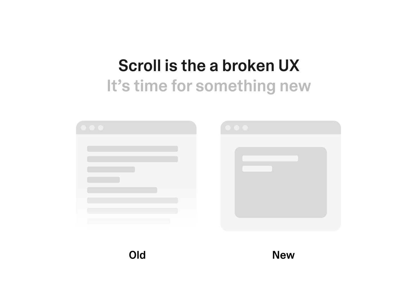
It’s passive.
It’s endless.
And super addictive.
And on top, it kills what we know as good design.
I feel like most products today are built like black holes.
No structure. No hierarchy. Just endless, infinite information.
Companies love it.
It's easy to build.
It keeps users “engaged.”
The more content, the better.
But here’s the truth:
Great design doesn’t show you more.
It shows you what matters most.
And in the age of AI, this is going to be more important than ever.
If you want to stand out, you should think about rhythm.
Breathing room.
A beginning, a middle, and an end.
Remember the products that felt deliberate?
Well, they were not the ones that made you scroll for hours.
Here's my prediction:
We need to start thinking beyond scroll.
Think fluid interfaces as an example (I know, one of my fav topics these days).
But here are two examples:
Imagine Spotify without a giant playlist or endless home feed.
Instead of scrolling through hundreds of songs, the app simply opens to a single, focused "moment" view. Curated to your mood, time of day, and activity.
You don’t browse without finding. You just listen.
The interface adapts in real time. Changing as your context changes.
And by the way this is already happening, it's just not visible to you.
But when Spotify launched their "daylist" it was the first step into that direction.
The same is true for apps like YouTube.
Instead of scrolling through 200 thumbnails on your screen, imagine a small grid of videos curated with intention.
Not based on what drives the most clicks, but what aligns with why you opened the app in the first place.
And when you’re done, it ends.
No autoplay trap. No endless scroll. Just enough.
That’s what a fluid interface looks like.
Components that appear when they’re needed, adapt to what you’re doing, and disappear when they’re not.
I call it "Context-aware by design".
So think about this when designing new products. The earlier you adapt the better.
The future isn’t infinite scroll.
It’s intentional flow.
LFG
Do you have an example where you applied this in Lovable? And if yes, what's the machine to make this technically feasible?