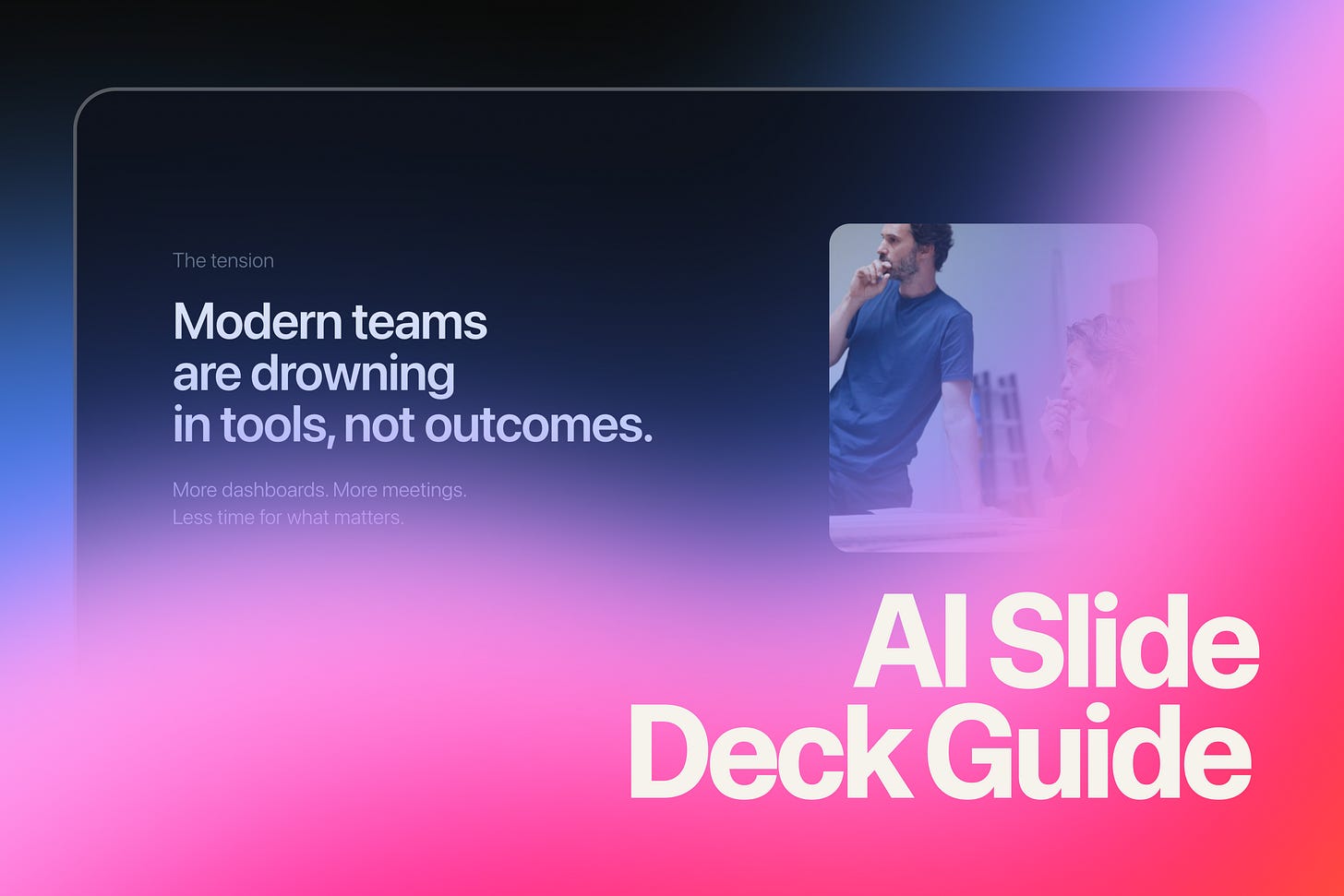
How to build stunning slide decks with AI
I recently posted a slide deck that I built fully with AI on LinkedIn and it took completely off.
So I created a guide to create animated, web-based presentations using Lovable.
Intro
Here’s what you do:
Copy the full prompt below (everything from “You are a senior product designer...” to “Build the full presentation now.”)
Open Lovable and create a new project
Paste the entire prompt in one message and hit send
Wait 1-2 minutes while Lovable builds your complete deck
See your presentation live — All slides, animations, and mobile responsiveness ready
Refine with simple messages like:
“Make the headlines bigger”
“Change slide 3’s background color”
“Speed up the transitions”
That’s it. One comprehensive prompt creates the entire app. Then you iterate naturally.
Why Build Slide Decks as Web Apps?
Traditional slide decks are static and constrained. By building presentations as web apps, you have:
Full creative control — Custom animations, interactions, and layouts
Premium aesthetics — Think Apple keynotes, not PowerPoint templates
Native responsiveness — Perfect on desktop, tablet, and mobile
Easy sharing — Just send a link, no downloads required
The key insight: AI can now handle both the design thinking and the technical implementation. You just need to guide it with clear constraints.
The Prompt (Copy this into Lovable)
You are a senior product designer and front-end engineer.

Your task is to design and build a premium, client-facing presentation as a web app — not a traditional slide deck.

Quality bar:
- Apple keynote level restraint
- Stripe / Linear / Arc aesthetic
- Designed, not templated
- Confident, calm, modern
- Strong typography and spacing
- Minimal text, high signal

GOAL
Create a 6-slide presentation that introduces a modern AI product to design-savvy clients.

APP MODEL
- Single-page React app
- Each slide is a full-screen view (100vh / 100vw)
- Only one slide visible at a time
- Navigation via keyboard and mobile gestures

NAVIGATION
- Arrow keys / Space to advance
- Swipe left/right on mobile
- Subtle progress indicator at the bottom
- No visible clutter

DESIGN SYSTEM
- Dark theme
- Background: near-black / deep navy
- Typography is the hero
- Large headlines (60–72px desktop, responsive)
- Minimal supporting text
- Intentional negative space
- Accent color used sparingly

MOTION
- Subtle, intentional animations only
- Opacity + translateY
- Ease-out
- Max 0.4s desktop, 0.3s mobile
- Motion should guide attention, never decorate

MOBILE
- Fully mobile-optimized
- Swipe is primary navigation
- No slide should scroll
- Titles ~36–40px on mobile
- Body text ~16–18px
- Touch targets at least 44px

SLIDES (CONTENT + INTENT)

Slide 1 — Opening
Single bold statement that sets the tone. No explanation. This slide should feel confident and calm.

Slide 2 — The problem
One clear tension modern teams feel today. Minimal copy. Let the typography do the work.

Slide 3 — The shift
A reframing moment. Introduce how AI changes the way teams work. This slide can use a slightly more expressive layout.

Slide 4 — The product
What the product enables. Not features — outcomes. Use a structured but minimal layout.

Slide 5 — Proof
Social proof or credibility. Metrics, logos, or a quote. Elegant, not salesy.

Slide 6 — Closing
Strong closing line. Clear call to action. Feels like a natural conclusion, not a push.

PROCESS
- Design the full deck end-to-end in one pass
- Prioritize design quality over speed
- Make opinionated decisions
- Apply a consistent visual and motion system across slides

Build the full presentation now.
Understanding the Prompt Structure
Now that you know how to use it, here’s why it’s structured this way:


