I see a lot of negative feedback about Apple’s new UI updates. But you are missing the point.
It’s not about glass effects or making every UI element transparent or shiny.
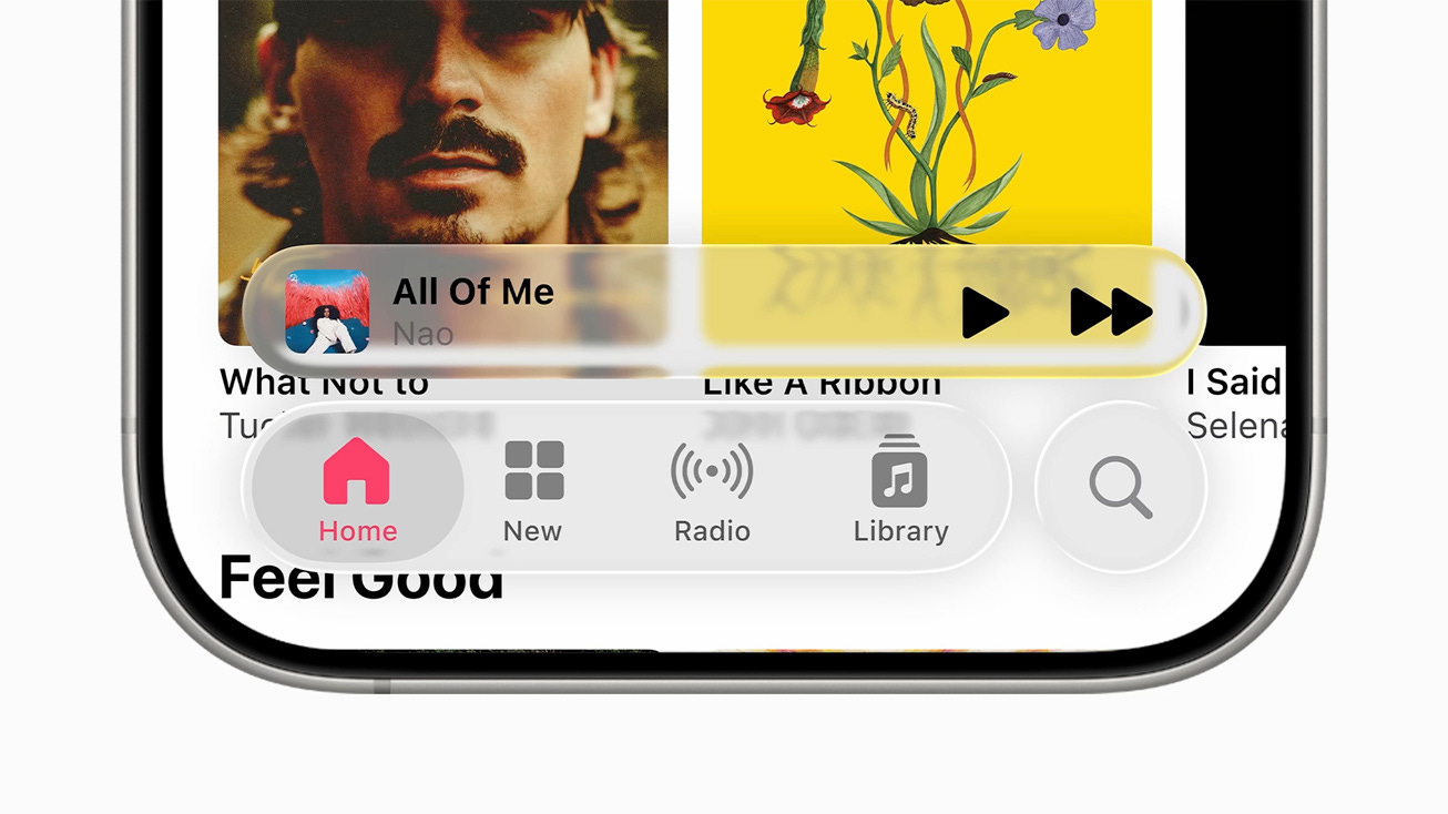
It’s about liquidity, depth, and movement. UI that feels alive.
We are entering a new era of interface design.
What was once static, flat, and fixed is becoming dynamic, adaptive, dimensional.
Flat design is over. And flat screens will be too. Sooner than you think.
I think Apple’s new UI system is less about a visual update.
It’s the first real step toward multimodal interfaces.
Where components aren’t bound to a rigid screen but float, shift, and respond.
They appear where you need them, and disappear where you don’t.
It’s about removing unnecessary clutter and making human-computer interaction feel… well, more human.
Just because we’ve spent the last decade staring at opaque UI components doesn’t mean it’s the optimal way to interact with computers.
Sure, it’s not perfect, but it’s the first real step into a new era of UI.
The future is screenless.
And dynamic components are the new screens.